
Background
Nottinghamshire Deaf Society wanted to develop its services within the corporate sector, providing training to help organisations better support deaf and hard-of-hearing customers, alongside services including sign language training and interpreting.
The Challenge
The Society was not particularly well known within the corporate market and needed an identity that would give its services greater presence and credibility when approaching larger organisations.
The identity also needed to accommodate different areas of expertise while clearly connecting them back to Nottinghamshire Deaf Society.
My Role
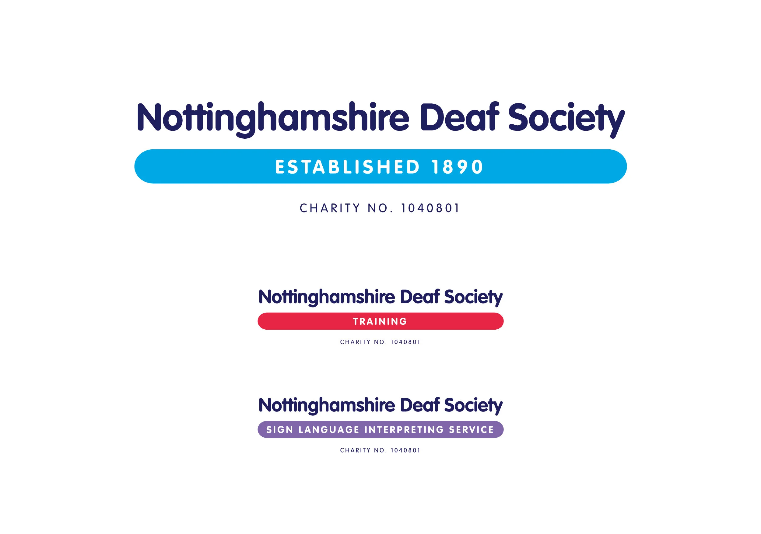
I developed a new typographic identity system based around three variations of the logo: the main Nottinghamshire Deaf Society identity and versions for its individual service areas, including training and interpreting.
Rather than relying on a separate graphic symbol, the identity used the organisation's name itself to create a simple and recognisable visual system.
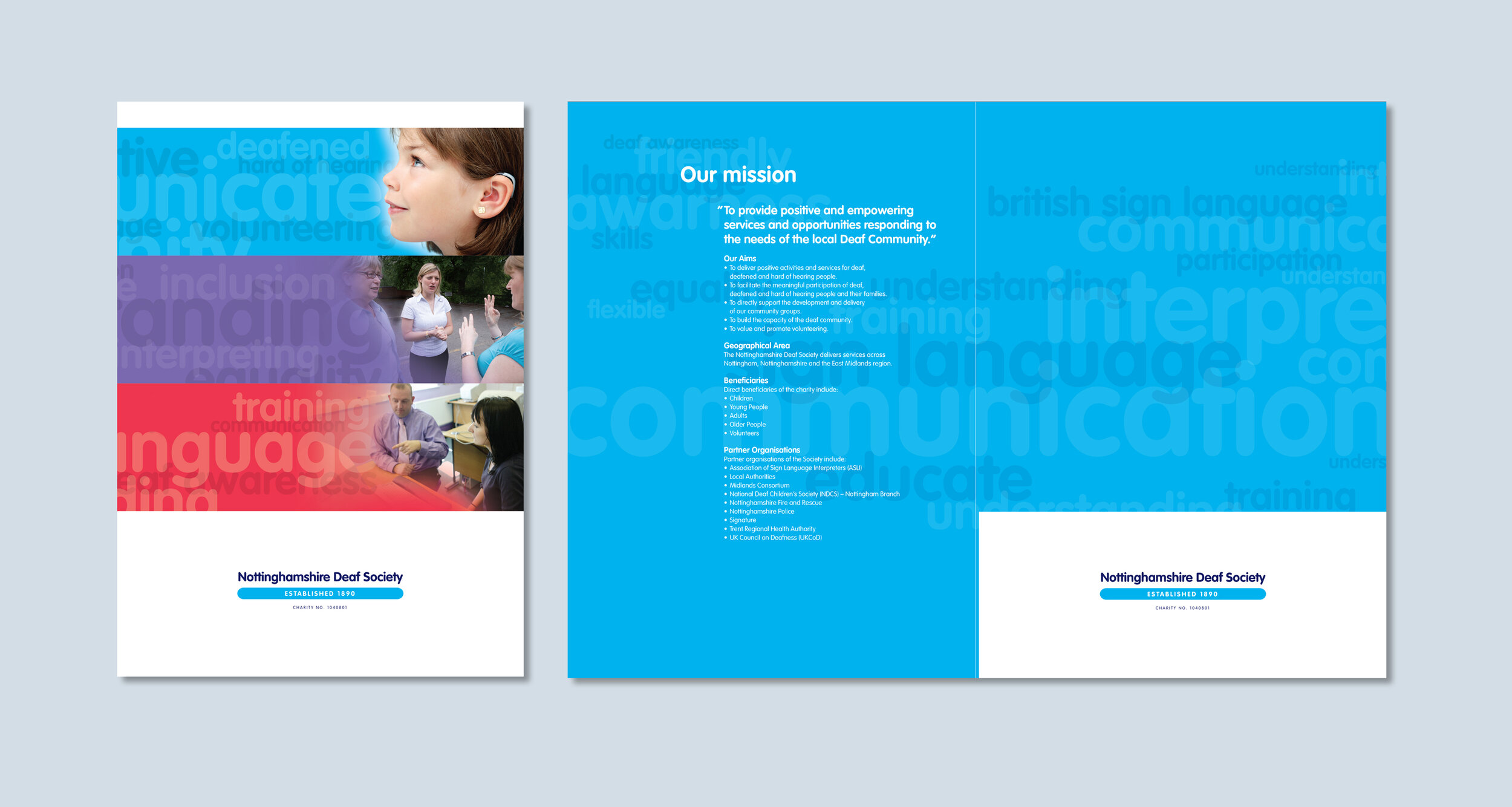
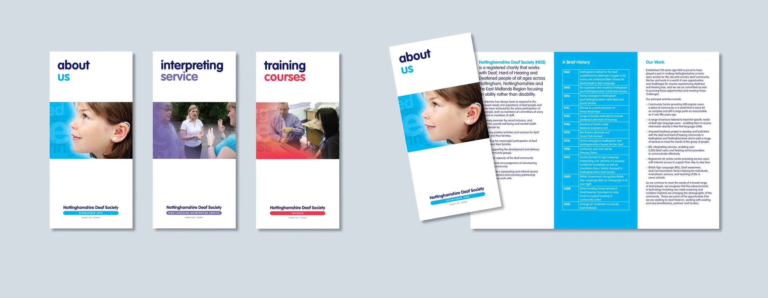
I then applied the identity across a corporate presentation folder and three leaflet inserts. The layouts were kept clear, approachable and easy to navigate, helping businesses quickly understand the different services available.
The Result
The completed identity gave Nottinghamshire Deaf Society a more cohesive and professional way of presenting its services to the corporate market, while the flexible logo system allowed individual areas of expertise to have their own identity without losing the connection to the parent organisation.